Color is one of the most powerful tools in branding and marketing. It’s a visual cue that evokes emotions, conveys messages, and profoundly influences buyer behaviors. The psychology of color examines how different colors, hues, and tones influence perceptions and decisions, making it essential for businesses to build a strong brand identity and connect with their audience.
Understanding Color Psychology
Color psychology is focused on understanding how colors affect human behavior and emotions. This concept is rooted in the idea that colors can spark specific feelings and associations. For instance, blue is commonly associated with trust and calmness, while red can evoke excitement or urgency. These associations aren’t arbitrary—they’re deeply ingrained in human experience and culture, influencing how people interact with brands.
The Role of Color in Branding
When it comes to branding, color is more than just an aesthetic choice—it’s a strategic decision that can define your brand’s perception. The color palette a brand chooses can communicate its personality, values, and positioning in the market. For example, a tech company might choose a particular shade of blue to convey reliability and professionalism, while a brand targeting a youthful audience might opt for more vibrant colors like orange or pink to convey fun and energy.
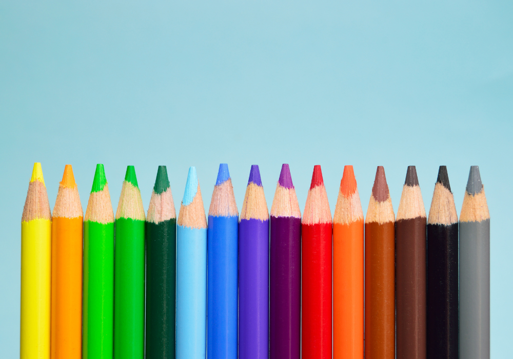
Here’s a closer look at how different colors are typically used in branding:
- Red grabs attention and evokes excitement, passion, and urgency. Brands like Coca-Cola and Netflix use red for energy, while CVS, Johnson & Johnson, BAND-AID, and The American Red Cross use it for its associations with love, health, and the human body.
- Blue is the most popular brand color, symbolizing trust, security, and calmness. Financial and tech companies like PayPal and IBM use it for reliability, and social media giants like Facebook and LinkedIn use it to reinforce trustworthiness and communication.
- Green represents nature, health, and prosperity. Brands like Whole Foods and Starbucks use it for sustainability and wellness, while agriculture and forestry organizations favor it because it represents the environment. Green also signifies wealth and luxury, conveying financial success and high-end quality.
- Yellow radiates warmth, happiness, and optimism, grabbing attention and stimulating mental activity. Brands like McDonald’s and IKEA use yellow to create a cheerful atmosphere, while Stanley and Caterpillar use it for visibility and to convey strength and dependability.
- Black signifies sophistication, elegance, and authority. Luxury brands such as Chanel, Louis Vuitton, and Gucci use black to attract a high-end audience and convey a sense of exclusivity. Athletic brands like Nike and Adidas also use black logos to express power, strength, and professionalism.
- Purple evokes royalty, superiority, and fantasy, making it popular for premium brands like Cadbury and Hallmark. It also has feminine associations, so brands like Babies-R-Us and Claire’s use it. While few major brands use purple, FedEx combines it with orange, green, and gray to stand out.
- Orange is vibrant and evokes energy, creativity, and warmth, but it can also be contradictory, seeming aggressive and suggesting caution. Brands like Home Depot, Nickelodeon, and Fanta use orange to convey enthusiasm and playfulness.
- Pink is associated with femininity and compassion, and it’s used sparingly for brands like Barbie and Victoria’s Secret, targeting specific demographics.
- Brown symbolizes reliability and earthiness, seen in brands like UPS but less common due to its subdued tone.
- White represents simplicity and purity and is often combined with other colors for a minimalist look.
The Impact of Color on Behavior
The colors used in branding and marketing do more than attract attention—they can significantly impact consumer behavior. Research has shown that color can influence purchasing decisions, brand recognition, and even how consumers perceive the taste or quality of a product.
For example, studies have found that up to 90 percent of first impressions about brands can be based on color alone. This is why fast-food chains often use red and yellow to stimulate appetite and encourage quick decisions.
Color can also enhance brand recognition. Consistent use of color across all branding elements helps create a solid visual identity, making it easier for buyers to remember and identify the brand. Moreover, color can influence how buyers perceive the quality of a particular company or product.
Cultural Considerations in Color Psychology
While specific color associations are universal, it’s essential to consider cultural differences when using color in branding and marketing. For example, white is associated with purity and peace in Western cultures, but in some Eastern cultures, it’s associated with mourning and death. Similarly, red is seen as a color of luck and prosperity in China but can signify danger or warning in other contexts.
Understanding cultural nuances is crucial for brands aiming to connect with diverse audiences. Researching and testing color choices in different markets ensures that branding effectively communicates the intended message across cultural boundaries.
Practical Tips for Using Color in Branding and Marketing
To leverage the power of color in your branding and marketing efforts, here are some practical tips to follow:
- Know your audience: Understand your target audience’s preferences and cultural associations. Choose colors that resonate with their values and expectations.
- Align with brand personality: Your brand’s color palette should reflect its personality and values. Consider using vibrant and unconventional colors if your brand is innovative and bold. If your brand is more traditional, use classic and muted colors to convey reliability and professionalism.
- Consistency is key: Chosen colors should be consistent across all branding materials, including your logo, website, packaging, and marketing collateral. Consistency helps reinforce brand identity and improves recognition.
- Test and optimize: Don’t be afraid to experiment with different color combinations. A/B testing, which compares two design versions to see which performs better, can help identify the colors that resonate most with your audience and drive desired actions.
The psychology of color is a powerful tool in branding and marketing. It can influence buyer behavior, enhance brand recognition, and convey the right message to your audience. Understanding and strategically using colors in your brand identity can create a compelling and memorable experience, helping your business stand out in a crowded marketplace.
Looking to elevate your brand and connect with your audience on a deeper level? Contact Verasolve today to learn how we can help you create a compelling, memorable brand identity that drives results.